Showing posts with label Tutorial. Show all posts

20090329

Tutorial: Presets, In Depth - Part 2: Creating Presets (and designing them to play together nicely)

Alright, sorry for the delay, but making money takes precedence over the blog, and I am sure my clients see it the same way. But anyways, let’s continue our exploration of Lightroom and ACR presets.

Today we will discuss the methods by which you can create presets for Lightroom 2 and ACR. I am sure many of you already know how to do so, but I am sure some of you don’t. We will cover a basic creation process in both Lightroom and ACR, but first I would like to take a detour and discuss preset “stacking” for a few minutes. Once we understand the stacking of presets, we can make presets that play well together allowing for multiple effects to be combined.

One common complaint about presets is that you can only use one at a time. This is not entirely true, but in general seems to be the norm. Presets (in both LR and ACR) adjust the different sliders in the develop module to create the desired effect for the image created on export. If you apply one preset, then another, most usually you will end up with just the second preset applied. This is due to the fact that you only get one slider for each tool, this isn’t Photoshop and there are no layers. You only have one set of tools, and the last preset applied will always override and previous presets or manual settings. This is the reasoning behind the belief you can only use one preset at a time.

That is not to say that you cannot use well designed presets in unison with one another. When you create a preset in Lightroom, the default dialog setting will save every setting applied to the preset. This creates a preset that will over-ride every single slider in the develop module. Your brand new preset will not work with other presets, it will replace them. This is fine for an import preset you will apply to every photo you import, but is not good for general creative presetting.

When creating you image, make note of what tools you use to generate your effect. I have a text file I print out to make hard copy notes about what I alter in the process of making my presets, when filled out it shows me what sliders I adjusted and those I did not. This allows me to save my presets with only the tools needed for the desired effect. If you do not touch the Basic Tone settings, make a note of that. When it comes time to make the preset, we will exclude the Basic Tone settings from the preset. If your preset only adjusts the Tone Curve, when saving the preset, make sure that only the Tone Curve is selected to be saved in the preset. By creating presets that only adjust what is needed for the effect; you will be able to combine multiple presets to achieve your desired effects. If your preset does not require any given slider to be manipulated, you should not allow your preset to alter those tools when applied.

I will recreate my preset design form as a prettied up PDF file, and release it here on LIDF for anyone else interested in being as anal as I am about my preset design. I wasn’t always this way, as many of my early presets alter every single slider; even if they are not needed…it was bad design and it embarrasses me. I am slowly updating the older preset to fix this oversight, eventually it will be done. IF you are just starting, don’t make my mistakes.

Now that I have that covered/off-my-chest, let us move on with creating a preset. Choose yourself a photo, and go ahead and make a few adjustments. As you make adjustments, make not of what setting you are altering, as these notes will be used to ensure the stacking-compatibility discussed above. I chose a random image from a wedding I shot recently.


For this tutorial, I am going to make a preset that adjusts the Vibrance, Saturation, Clarity, Tone Curve, Split Toning and applies a strong vignette. Honestly, this preset sucks, it gives the picture a really bad look. However it is suitable for what we are going to do here. Here is a view of my develop module sidebar, showing only what is changed.


I make it a habit to start out my development process with all the tools closed. Only opening the tools I need as needed. As you can see, I did not even mess with HSL or Detail tools, so they are still closed. Once done with the image adjustments, I make my notes on which Items were adjusted in the Develop Module. We are ready to save this preset.

Now head over to the Left Sidebar and go to the Presets Tab. Click on the plus (+) icon on the Presets tab.

Once you click the plus icon, it will open the New Develop Preset dialog.


This image shows the dialog box with the normal default settings. You dialog will show the same options used in the last preset saved on your machine. If you click save now, your preset will be saved adjusting every slider in the develop module, not what we want. So, start un-checking the boxes of the tools you do not require. Here is my dialog, adjusted for my preset.


This dialog shows only the tools needed for the presetted effect selected. The Color and Vignette checks became boxes, as I only saved some of the sub-options there in (Vibrance and Saturation in Color; Lens Correction in Vignette). The Color check box’s Color Adjustment selection is used when you make changes to the HSL settings; I felt I should mention that, as it is not overtly clear.

Also, at the top of the preset dialog is a box of options, called Auto Settings:


Color images will show only Auto Tone, monochrome images will show Auto Tone and Auto Grayscale Mix. Auto Tone, when selected, caused the preset to automatically adjust the Basic Tone sliders to what Lightroom deem to be the most appropriate settings. Auto Grayscale Mix will allow Lightroom to automatically adjust the Grayscale mixer, to what it deems to be a proper grayscale mix. These tools can be handy, but can create unpredictable results in application. I never use the Auto Grayscale, but I frequently use the Auto Tone option, especially in my film emulation Auto Presets.

Now click the Create button, and your preset will appear in the Preset Folder defined at the top of the dialog.


You have made your preset, we will discuss exporting your presets for others to use later in Part 4 of this series.

So, that covers Lightroom. So we will just jump to ACR, and just cover the process to save your preset. We will assume that you already have the image adjusted.
I again have the same image adjustments made to the same image.


Click on the option icon, depicted by the arrow in the above image to open the File Settings Menu


Click on Save Settings... This will open the save setting dialog.


This dialog looks a lot like the New Preset dialog in Lightroom. Again, it selects every adjust made available to you. Follow the preset design rules, and only select the options that you need for the preset. Here is mine again.


Once everything is properly configured, click Save… This saves your preset, bringing up the save dialog.


Give it a name, and click Save. You preset is now in ACR’s preset menu, as noted in the following image:


You are done.

I should have a few good posts in a row over the next few days, so check in again soon.
Part 3 will be coming soon. Covering updating and combining presets.

Until then,

Michael

20090320

Tutorial: Presets, In Depth - Part One: Installing and Reading Presets

Again, apologies to my regular visitors, and all of you who already know the information I am about to regurgitate. There will be a new preset release soon, as in tomorrow, so please bear with me. If you are new to Lightroom, then go ahead and read on.

Okay, so you just downloaded some new presets, and you can’t wait to take them for a spin. First you will need to import them into your application of choice, be it Lightroom or ACR. We will walk through the process for both applications. Then I will show you how you can look inside a preset and see what it does, without even running it in your application.
So first, place your preset files (Extensions of .lrtemplate for Lightroom, .xmp for Photoshop) into a folder on your desktop. Name it whatever you want, as it is just holding the files for now. If you downloaded an archive, such as the .zip files I use here, make sure you unpack the archive before moving on.

First we will look at the method for Lightroom. Simply fire up Lightroom and get into the Develop module. Once the module loads, look to the left panel, and scroll down to the Preset tab, if you don’t already see it. Make sure to expand the tab if it has not already been opened by clicking on the small triangle on the left.


You should now see a folder entitled Lightroom Presets, which are the presets included with Lightroom itself. Beneath it is a folder entitled User Presets, bring your cursor next to it and right-click. Up pops the contextual menu with the options of “New Folder” and “Import”.


Click on “Import…” Once the dialog box opens, point the explorer to the desktop and open your folder you made earlier. Inside, highlight the .lrtemplate file you wish to import.


Then click “Import” and your new preset will be installed in the User Presets folder.


Now your preset is installed and ready for use. However you will rapidly make your User Presets folder a catastrophic mess. So you need to organize a bit. Let's go ahaead and make a new folder.

To make a new folder, right click again by the User Presets folder and choose “New Folder”.


Name it whatever you choose.


This will create the new folder in the presets menu.


You can then drag the imported preset to the new folder or right-click next to it and import another preset into the new folder.

Pay attention to how you organize your presets in Lightroom, as they are a pain to sort after you have amassed a large amount. This is since Adobe only allows 1 level of folders in the presets menu. Hopefully in future releases Adobe may endow us with nested folders, and if they do it will drastically improve organization of presets.

Installing presets in Adobe Camera Raw nowhere near as elegant or user friendly, however it is quick and effective. In fact, to install the presets, you do not even have to open Photoshop, let alone ACR. To install presets into ACR, it is easiest to do it via your operating system. So open up Finder in Mac or Explorer in Windows, and point it to the following path (I believe Vista should be the same as Windows 7, but I am not sure. Vista users try it both ways):

Macintosh: /Users/UserName/Library/Application Support/Adobe/CameraRawFolder/Settings

Windows: C:\Documents and Settings\UserName\Application Data\Adobe\CameraRaw\Settings

Windows 7: C:\Users\UserName\AppData\Roaming\Adobe\CameraRaw\Settings

Please insert your user name for your system into the respective path where you see UserName. If your system is installed normally, this path will place you right into ACR’s preset folder. Here is a screen from my system:


Now all you have to do is copy the .xmp presets for ACR right into this folder.


Close the folder and start Photoshop. Open a RAW file to bring up ACR.


Once ACR opens, click on the presets tab.


Almost magically your presets are ready to go, no other work needed. I strongly recommend only keeping presets you frequently use installed in ACR, as there is no method by which to sort them.

This is not to say that this is the only way to install presets in either program, but they are the most straight-forward in my opinion. Likely most all of you already know how to do this, but I felt that I should cover it anyways. Now onto a topic some people I know are not aware of… how to see what a preset does without loading it into Lightroom, or “Reading” a preset.

To read a preset, simply open the .lrtemplate file in any text editor. In Windows, you can just open Notepad and drag the .lrtemplate onto the empty Notepad window. This will open the preset in plain text. Although it can appear to be intimidating at first, take some time and look it over. You will start to see correlations between the text and the sliders in Lightroom. (Click the image below to view larger):


If you look at a presets text dump, I am sure you will start to see the correlations from the text file to Lightroom. A preset automatically configures your Develop Module tools for you, that is all they do. By looking at the text dump of any preset, you can see exactly what it will manipulate in Lightroom before you use it allowing you to know what to expect. It just takes a little time to get used to a tools internal name in the preset compared to the label on the slider in Lightroom. With a few reads and comparisons to the Develop Module you will get a quick understanding. You may not look at a preset’s text dump often or at all, but when you are away from your Lightroom computer, like at work, taking a peek inside a preset can tell you a lot, especially when you get familiar with Lightroom.

Also, it is possible to convert Lightroom presets to ACR. I have a tutorial up on X-Equals that explains the method to accomplishing that. Jump on over. Also, the presets I installed during this process were from Brandon's excellent collection of presets that can also be found on the X-Equals blog, click to be transported to his list of great presets. Don't forget to check out my article on sharpening in Lightroom over there too!

Hopefully this might help someone. If not, I just wasted a lot of my time writing, well not too much time. But again, I felt I needed to cover these tasks if I am to move firther into discussing presets in Lightroom and ACR.

Back again soon,

Michael

20090319

Tutorial: Presets, In Depth – Introduction


Right off the bat, I would like to apologize for the following posts. Many of you will already know everything I am going to get into with this article (and the next part in the series). I have always assumed that if someone found my blog and presets that they already knew quite a bit about presets; what they actually are, how to make them, change them and use them to their fullest extent. However, I have received many questions from people who have just gotten into Lightroom who are not entirely clear on what presets are. Even though many people, more talented than I, have covered this topic, I felt maybe I should devote some time to the subject. Please bear with me if you know all this already (anyways it more content and more practice writing).

So, for everyone still with me, let us dig on in. Lightroom and Adobe Camera Raw are both amazing, powerful tools that allow you to manipulate, interpret and create images. When using RAW files, the tools provided to you in the Develop Module allow a level of control over your images that is almost insane. The Develop Module offers you over 60 sliders to enhance your image, each affecting the image in different ways. That is not even counting the local adjustment tools or the tone curve! The sheer amount of tools provided and the power of each one allow you to interpret the RAW data provided by your camera in amazing ways, and can be a bit overwhelming.

The manners in which all of these tools are configured make your “recipe” for your image. When working with the sliders, it can take quite some time to achieve the effects you desire. However if you have to adjust every image in your shoot, making them look similar, it can become quite tedious. You have the option to copy and paste these settings from image to image, which may work fine for a single project. However you may find yourself referring back to that same “recipe” time and time again. Having to go to that original image each time and copy its settings would become quite the burden.

To remedy this situation, Adobe endowed both Lightroom and Adobe Camera Raw with a system to save these image “recipes” and to apply them to any image in just one click. This system is called Presets and the act of making them has been coined “presetting”. Countless individuals have made it a personal hobby to create these presets and share them with the world; others have set out to make finely-tuned presets that they offer for sale. These Presets allow others to apply the same processing that the creator made to their own images, greatly improving their workflow.

Presets can be used many ways. Some people simply choose an image; choose a preset, click and BAM! They have their image. While this works for a great many, and is great to discover what a preset does, it is usually not the best method to produce you final image. Presets should be used as a starting point. You choose the preset you wish to apply to your image, apply it and then proceed to further process your image. You may tweak the colors, white balance, tone curve and so forth. You should always sharpen and reduce noise yourself, when needed. That is not to say that your image won’t look great without further work; I have seen many 1-click images I found stunning, but you should always give your images the benefit of deeper study. You may decide that the image is perfect as soon as you click that preset, but more often than not, you will see where a little attention can make a good image great.

So over the coming days, not necessarily every day, I will continue this series. Now that you know what a Preset is, in general, we can move forward in discovering how you can use, modify and create your own presets. Once you get all this information, you will see what the true power of presets is, the ability to save you time and repetition. Hopefully this may lift some of the stigma presets carry, that they are lazy and counter-productive to creativity. Yes, you can do what any preset does without using a preset; it will just cost you time. When you have 100 photos to adjust, time tends to works against you.

So, a quick syllabus to let you see what will be forthcoming in this series:

Part 1: Installing and Reading Presets – I will run you through the installation process for both Lightroom and Adobe Camera Raw and then show you how to open you presets in a text editor, so you can see exactly what is adjusted when you use a preset.

Part 2: Creating Presets – A short instructional on the steps involved in creating a preset from a developed image. Covering the process of creating the preset and configuring it to adjust only what needs to be adjusted in an effort to produce presets that can be used together, also known as “stacking”.

Part 3: Customizing Presets – Sometimes, you have a preset you use frequently, but you often have to make some adjustments to the images afterwards. If you find yourself making the same alterations time and again, then you need to modify that preset to fit your needs. I will run through the steps required to alter an existing preset, tailoring it to your needs.

Part 4: Preset Tips – In the final chapter, I will delve further into some tips and techniques you can use to enhance your workflow with presets, be they your own creation or those of others. I will also discuss how to make “Preset Sets” that you can install and uninstall as needed, to keep your preset panel clean.

So stay tuned, I will release a few presets during the run of the series, so it won’t all be dry reading. I will be back tomorrow, don’t know if I will be bringing presets of words, but I will have something for you.

Until then,
Michael

PS: I have a new tutorial up over at X-Equals delving deeper into the sharpening tools in Lightroom. Part 1 is up today focusing on sharpening in the Develop Module. Hop over to X-Equals to check it out. Part 2 on export sharpening is forthcoming.

20090225

Random Items: ACR presets and Customizing LIDF Presets for Your Needs

So lately I have been fielding some questions via e-mail and reading some great criticism on other blogs. All in all, I feel the response to my presets has been amazing, but in the interest of always improving, I want to say a few thing that may help clear up some common issues.

Issue 1: Over Aggressive Tone Curves

Alright, I admit some of my tone curves can be harsh when used on high contrast images. I have noticed this and I am currently revising some of the worst offenders to help alleviate the problem. Frankly, it is hard to duplicate the effect of film, as each batch is different, and every frame can differ based on condition in which the photograph was taken. If you notice your image is breaking (excessive posterization in shadows, strange artifacts, etc) I recommend you take a look at the tone curve and make a few adjustments.

If the tone curve is steep, with deep shadows and bright highlights, you may want to pull the curve back on either side, flattening out the image. You may also want to adjust the Point Curve option in the Tone Curve window down a step: from Strong to Medium, Medium to Linear. These alterations may improve your image. The primary concern in my emulation preset is the color settings, with the tone curve coming in second. Try to fix any problems using the tone curve, it may help you out more if/when you take the image into Photoshop.

If you find yourself frequently altering the tone curve of a particular preset, you may want to consider permanently altering the preset to your needs. After making your corrections, right click the preset name and select Update. Hit okay afterward, now you have made the preset your own. If you find that you get better results, email me about your alterations...you may be the extra set of eyes that helps me improve my emulation. Contact emails are on the left side of the blog.

Issue 2: Adobe Camera Raw Presets

For a while, every preset I make has an ACR preset included in the release. The ACR presets are located inside a folder in the archive entitled "ACR Presets". Every film emulation preset on LIDF now has ACR counterparts to the Lightroom presets. Most of my style presets also have ACR counterparts.

To install the ACR presets all you have to do is copy them to the corret folder for ACR to access them. They folders are as follows:

Macintosh: /Users/UserName/Library/Application Support/Adobe/CameraRawFolder/Settings
Windows: C:\Documents and Settings\UserName\Application Data\Adobe\CameraRaw\Settings


Simply replace your current user name into the folder structure where you see UserName. These folder paths lead you right to where you need to copy the .xmp files found in the ACR Presets folder. Once you have them copied over, the next time you open ACR the presets will be available in the Preset tab in ACR (Which is the button furthest to the left under the histogram).

Alot of people were not aware how to install these presets, and if you are interested in converting Lightroom presets yourself, please refer to my post over on X-Equals. It walks you through the process, and gives more indepth direction on installing presets into ACR.

Issue 3: Non RAW Images

If you have been to LIDF lately you may have seen the poll on the top left side of the blog asking if I should make presets for raster images in Lightroom. Overwhelmingly the answer was no, but I saw enough intrest in raster images that I made a decision. I am going to start woking on Photoshop actions to accomplish much the same effect as my presets. This will likely be a way off, and the releases nowhere near as frequent as my Presets, but I plan on doing it.

I decided to forgo presetting for jpegs, as I found the results less than adequate, and I feel Photoshop is the place to make these pixelpushing changes anyways. Take away the power of RAW data and Lightroom is rendered fairly inept for my emulation purposes.

Keep an eye open, they will be coming.

Issue 4: Using My Presets

Finally, if you are using my presets and getting great results, let me know. I want to see and hear about successes. In the same right let me know about problems you encounter, feedback will help these presets improve.

If you use my presets on your own personal blog, drop me an email or a tweet on Twitter, and let me know. I love to see others work with my tools and I will happily send everyone who views this site to you to see what you have done. I enjoy showcasing those who use m presets.

If you are on Flickr and post images processed with my presets, you don't even have to email me. Just tag you image with "LifeInDigitalFilm" or "LIDF" along with the emulation used in the description, I will find them as once a week I troll Flick looking for examples of my presets in use. If you have a number of images using my presets, I will showcase your Flickr stream just as I would a photoblog.

Maybe it is vanity, but I enjoy seeing my work paying off. Also I can see any inadequacies I did not encounter whilst testing the presets out myself. Again seeing them used can help me further refine and improve my presets.

Well thats it for today, another preset is coming tomorrow!

Until then,

Michael

20090210

Tutorial: Monochrome Magic in Lightroom (ACR too!)


Small Stroll 2, originally uploaded by GrayImaging.


Okay, so as you can tell, I enjoy my black and white photography. The majority of my presets were B&W at first. To that extent I have spent quite some time making monochrome images in Lightroom. So now I will share what I have learned. This is not a step-by-step tutorial and I will be assuming you are familiar with all you develop tools in Lightroom (or ACR...the tools are pretty much the same).

1] Color Mixer

To me, the most important tool in a monochrome conversion is the Grayscale Mixer. In this panel you adjust the intensity of each color channel represented in the black and white image. A slider to the far left renders the color channel very dark, all the way to the right, very bright. You want to manipulate these sliders to get the right look for your image.

Of particular interest for photos with people in them are the Red, Orange and Yellow channels. These three color channels control the skin tone of people, regardless of skin color. The orange channel wields the most control over skin tone, adjusting the overall tone. Red comes in second most influential, effecting blushing and blemishes. Yellow really only effects highlights. Balance these three to get the desired skin tone.

As far as the other colors are concerned, simply adjust them as needed to complete the look. Always adjust slowly and incrementally, allowing yourself time to view the changes. Avoid over adjusting, as it will lead to unbalanced image tone and possible artifacts in the image.

If you are using my film presets, try to avoid adjusting any color slider more than absolutely needed, as any alterations to the color mixer change the tone and therefore change the effect. I recommend only altering the orange channel to save skin tone whenever possible. You shouldn't have to adjust much as I spend extra time making sure skin tones look good.

2] Tone Curve and Contrast

Contrast is of the utmost importance in monochrome images. Too much and the picture gets muddied up, too little and the image gets too thin. You are looking for a happy medium with both dark blacks, bright whites in the image and smooth transitions between them. You have two tools at your disposal for this, the Contrast slider and the Tone Curve.

The Contrast slider adjusts the contrast in the image globally, and is the easiest method by which to adjust contrast. However it is a bit simplistic, not allowing for fine control over the image.

Where you really tweak the contrast is the Tone Curve. Before making alterations to the curve itself, look below it for the Point Curve. It will be set to one of the following; Linear, Medium Contrast or Strong Contrast. Select between the three setting looking for the one tht gets you closest to what you are looking for. It won't be dead on normally, but one of the three will give you a good starting point.

After adjusting the Point Curve, start manipulating the curve itself. You have two options here, to adjust the region sliders or to drag the curve to where you like it. The region sliders refer to different areas of the tone curve graph. Across the bottom of the graph you see a bar with three adjustment points with four sections varying in shade. The far left is the shadow ( darkest parts of the image), middle-left is the darks, middle right is the lights and far right is the highlights (brightest parts of the image). If the highlights are too bright or blown out, you can drag the highlight slider to the left or click & hold on the tone curve line on the right side of the graph and drag it slowly down. If you move the line you will notice the slider automatically moving; I much prefer dragging the curve myself as opposed to manipulating the sliders, but move it the way you like.

Tweak the tone curve until it fits. You will notice when dragging the line Lightroom imposes some limits on how far you can move it. Try to avoid laying right on Lightroom imposed boundaries, it crates bad images in my opinion. You can lay the shadow and brightness to that edge to get absolute black and absolute whites when needed.

When using my film presets, I do not recommend adjusting the Tone Curve any further that altering the Point Curve setting. Doing so changes the desired response for the film being emulated. Changing the Point Curve is fine as it changes the size of the curve, not the basic shape. Feel free to use the Contrast slider with my presets as it will allow contrast changes whilst staying inside the confines of the simulated film' tone curve.

3] Local Adjustments (Brushes and Gradients)

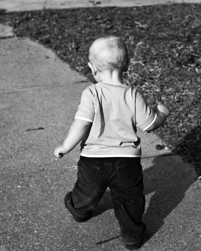
Bring back some of the old darkroom magic with local adjustments in Lightroom. Dodging and Burning are time honored techniques in the darkroom and are easily simulated in Lightroom. Say the image is too dark in parts leading to loss of focus on the subject. This was the case in the photo at the top of the post. My son's shadow merged with his pants after I applied my Neopan Acros preset. So I simply clicked on the adjustment brush, selected the shadow and increased its exposure, lightening the shadow to differentiate it from his pants.

You can bright and darken by this method. You can locally adjust contrast and brightness. Most importantly to me you can locally adjust clarity. Most of my film presets crank up clarity to get the sharp look of film, however this may not be desirable in photos of people. If this is the case, locally select the face and drag the clarity down. This will reduce the detail level in the face, allowing you to soften their look to make it more appealing. You can even bring clarity down into the negative range to create a soft focus effect, blurring out fine detail whilst retaining normal detail. In other words, fade away wrinkles, freckles and so forth...plus negative clarity makes skin glow, and you can make it look almost surreal.

Local adjustments with the adjustment brush allow you to really fine tune your monochrome image, but do not forget to use graduated filters when you need them. Drop a grad filter across a bright sky and bring the exposure down a bit to bring out detail and balance your image. Play around with you local tools, as they let you bring back the old darkroom techniques that were used to create prints. As any old school B&W photog will tell you, making the picture on film is only part of the process, putting it on paper is the rest. Dodging and burning to bring added depth to a print, sometime even from a flat negative.

4] Image Details (Sharpness, NR and Vignettes)

Don't forget about sharpening and noise reduction either. It is often easy to forget to do so when working in monochrome. Sharpen you image for you desired output, be it screen or print. Sharpening ca also be used to accentuate noise in the image, which is desirable if you are emulating a high-speed film such as Neopan 1600. Work the noise reduction sliders to either smooth out the image or allow more grain to shine through. These tools allow you to give your image that classic film look about as good as you can in Lightroom. Hopefully one day they add a grain control also.

Although I am not big into vignettes, the look great in monochrome. Play around with getting those corners darker, sometimes it unlocks a feeling in an image that you do not get otherwise.

5] Toning

Finally if you want to tone your monochrome image, play with split toning. You can choose either the highlight or shadow split tone and give it an orangish-red to create a sepia image. You can even set the highlight and shadow to different hues and saturation levels and adjust the balance slider to get a nicely balance duo-tone image. Play around, try sepia, blue and green tints. Toning is another way to really kick up an image.

Obviously these are just a few of the tools at you disposal to create beautiful monochrome images, however these are the area I work the most with and I figure I would share it with everyone. Sorry there were no screen shots, but this is a fairly long post and I wanted to get it up before I went to sleep. If you are familiar with Lightroom you get what I was saying. In the same right these tools are also in Adobe Camera Raw, so those of you with just Photoshop are not left out either.

These steps work if you are making a monochrome from scratch or utilizing my presets or those of others. Just take some time and explore each of these areas in Lightroom deeper and you will be making great black and white images in no time.

Oh, a new preset up tomorrow!

Until then,

Michael

20090209

Tutorial: Snapshots (The Lightroom Version Control System)

When I shot a wedding about six months ago, I came to the startling realization that I had some major flaws in my photographic workflow. It was my first job of significant size, about 2000 images shot during the day. When I brought it into Lightroom, it was not too bad; I went in and flagged my photos, fixed bad crops, made the normal adjustments and exported for my proof prints. Not so bad. Fun even.

Then my print orders started coming in. This one in black and white in 5x7 and again in color, make it look like film, in 8x10. Spread this out across about 300 photos, the next think I knew I had about 1000 different virtual copies running about, in different crops with different processing. After that job, I decided I need to figure out how to organize a bit better.

I started playing around some, and in the process of developing my presets, I discovered the wonder of Lightroom Snapshots. Snapshots let you save a version of the file, with all processing intact to use later on. You can save multiple revisions of the same file into a handy menu located just above the History panel in the left develop pane. You can save a B&W version, color version, different crop sizes, different vignettes and keep it all contained in the original file in Lightroom. No virtual copies needed.

Now I'll walk you through the snapshot process.


So we have the image up. Look for the arrow on the left side of the screen showing you the Snapshot pane. This is where the action goes on. Now, we will assume you have been processing you image and you have your final color version ready. So you are going to make a snapshot of the full frame image.

Just click on the plus icon on the Snapshot panel.


After you click on the plus icon, a white data box appears where you give the snapshot a name. The name you give is attached to the snapshot and embedded in the files entry in you LR catalog.

Now make another version of the same image. I am taking it B&W, cropping it to a 5x7 and adding a vignette.


With that applied, I repeat the steps to make a snapshot.


Now you can see 3 snapshots. one for the Color Original, one for import, and one for the B&W 5x7. Just by simply clicking on any of these snapshots load up all the adjustments to provide you with the image that you have saved. There is no limit I have ran into for snapshots and I often have over ten different versions of each image.

An added bonus, if you write the metadata to the RAW files from within Lightroom, all the snapshots will be saved in either the DNG or a sidecar XMP file. The snapshots are then portable and can be used in another copy of Lightroom or even Adobe Camera Raw. You will find the snapshots in the presets tab in ACR.

I know this is a rather rough run-down on the process of using snapshots, but give it a try. It is nice to have eight different revisions of an image at your fingertips without having excessive virtual copies running amok in your catalog. As I said, snapshots are Lightroom's own Version Control System.

Keep Shooting,

Michael

P.S. Cold Storage Presets Collection....you know the rest.

20090114

Tutorial: How to convert LR presets to ACR

[This article has been rewritten and published at x=blog 01192009]

I recently stumbled upon a method by which you can import Lightroom develop presets into Adobe Camera RAW for use with Photoshop and Photoshop Elements. I’m sure someone has written this up before, but I have never seen it, as I discovered this by chance. In retrospect this seems overly obvious and many of you may know how to do this already, but if not read on.

As a die-hard Lightroom addict I personally never had the need to deal with Adobe Camera RAW. All my trips into Photoshop were initiated from the context menu inside Lightroom. However, I recently finished touching up a RAW file for a colleague and I wanted to have my edits saved with the file. Knowing she does not use Lightroom, as she is an Apple fan running Aperture, I needed to save the Lightroom edits to be rendered in Photoshop. I exported my edited file as a DNG she could open in ACR, then I hopped into Photoshop and opened said file. As I suspected all my edits were intact, they should be as ACR and Lightroom use the same RAW engine. Life was good.

However, looking at my fully edited file in ACR I realized that I could save these develop settings as a preset in ACR, opening the presets I design to a whole new audience. If you follow the steps below, you too will be able to convert any preset you use into an ACR preset.


1. Open Lightroom, and edit any RAW file in your catalog by applying the preset that you wish to convert over to ACR.

2. Once image is satisfactory, right-click (Windows) to bring up the context menu. Choose “Export” in the menu and then the “Export…” option. This brings up the export menu. Setup the export for “Files on Disk”. Choose your export location, set naming for custom name and give the file the name of the preset you are exporting. Most importantly, in the File Setting section, change the format to DNG. This will rewrap your RAW file into DNG and include any modifications currently done to the image (the applied preset).

3. You can now close Lightroom. Open up Photoshop (or Elements), and open the DNG file you just made. ACR will pop up showing your exported file with all edits intact. Take this time to run through ACR’s options and make sure everything looks right. If so, move on to the next step.

4. Now look at the ACR window. To the right, just under the histogram is the buttons controlling ACR adjustment features. Look for the one on the far right with the three sliders depicted on it. Clicking this leads to the Presets menu. Now simply click the small icon in the right corner of that window, it has 3 lines and a small arrow. It opens a menu, in which you will choose “Save Settings”.

5. This will open a dialog with all the controllable options for the preset, and is much like what you see in Lightroom when making or editing presets. Place a check by every option you want the preset to adjust. Uncheck any boxes you want the preset to leave alone. If you check “Apply auto tone adjustments” or “Apply auto grayscale mix” then the preset will override any of your Lightroom edits in those areas. I would not use it unless you know what you are doing.

6. Once done, click on “Save”. Then you are offered a Save dialog box with the filename of the DNG in the window. If you named your DNG for your preset, just click “Save”, if not change the filename and click save. Your preset is saved to the presets dialog in ACR. Open another RAW file and test it.
Now you can use your favorite Lightroom presets inside of Photoshop, or make a preset for a friend with Photoshop but no Lightroom. Let them see what they are missing.


Another benefit I have found to exporting my Lightroom preset to ACR is that I can store them on a USB drive and use them on anyone’s machine. You can copy your ACR .xmp files from this path:

C:\Documents and Settings\UserName\Application Data\Adobe\CameraRaw\Settings

Copy the .xmp files to your USB drive. You can them manually apply any preset off the drive. Just click on the menu icon in the presets tab, choose “Load settings…” and point the file browser to your usb drive. Click and go.

I hope this helps anyone who was curious as to how to carry out this process. Hope it helps you and your workflow.

Until next time,
Michael

20090112

Lightroom Film Emulation Preset Tips


Tour of Missouri - 5, originally uploaded by GrayImaging.

As I had mentioned yesterday a lot of people seem to think that these presets of mine are expected to produce film like results with one click. Although you can get excellent results from these presets with a single click, you will not properly emulate any film without some additional work. Hopefully this will guide you a bit further into using my presets for emulating the look of a film.

1: Know Lightroom's Limitations

Okay this is right out the barn door, know what Lightroom can and cannot do. You can not emulate grain in any way, shape or form currently. Outside of shooting at a high ISO to get noise, you will have to add grain in Photoshop, Paint Shop Pro, or GIMP. I have tried to simulate the look of grain with noise reduction turned off and sharpening cranked up...it does not work. If you need grain add it in your pixel editor.

Lightroom can manipulate any RGB image, however, it will not be able to utilize all its power on a rasterized image. If you need to edit a non-RAW picture, make sure that it is at it's highest quality. At least a 16-bit uncompressed TIFF or PSD. If it is a scan, get the highest color bit-depth and the highest resolution feasible, the more information Lightroom has to work with, the better. Whenever possible use RAW. I develop these presets assuming that they will be utilized for RAW processing. Apply them before you hop into Photoshop with an image.

Lightroom uses a unique colorspace based of Prophoto RGB. Know this when exporting. There will be color compression. Always proof your exported images. If you are doing pixel manipulations in Photoshop, I feel you should export as a PSD at highest bit-depth in the Pro-Photo colorspace. Or, you can export the file as a DNG with all your edits saved, and open that DNG in Photoshop ACR. (hint: if you use ACR alot you can save the develop settings embedded in the DNG in ACR and utilize any preset in ACR that way. Kind of making ACR versions of any preset. I will be getting to that eventually.)

The more you know about Lightroom, the better you will be able to use my, or anyone else's presets. Read tutorials, grab a book. As NBC says "The More You Know...."

2: Watch those skin tones!

In color slide presets, often you will get horrid skin tone, especially on Caucasian skin. If they appear too red or orange, go to the color mixer and lower the Orange channel saturation until the skin tone looks correct. If you only drop the saturation until the skin looks good, it will improve the photo and alter the color response being simulated only slightly. Beware, doing this with a lot of fall colors in frame, as they will be effected. The less change required the better. If it still does not look right, hit orange luminance next, and last red saturation. Try to avoid messing with red as much as possible, especially since it is a primary color and changes will effect the simulation quite a bit.

3: Dig for artifacts.

Primarily when working with black and white presets, keep an eye out for strange halation effects and odd toning in your subject, essentially "breaking" the image. If you notice either, lower or raise the offending color channel and see if it will alleviate the problem (refer back to the original color image). If that does not fix the problem, adjust the sharpening first (you can always sharpen in Photoshop), and then look at your contrast. Sometimes excessive contrast will cause images to "break".

4: Know what the film should look like.

If you shoot or have shot the film you know what to expect, making it easier to duplicate the look. Presets are made to give you a good starting point, and I develop these to simulate color reaction and tone curve as accurately as possible. However, film reacts differently in the real world, so know what you are looking for. If you never shot a particular film you can always google the film you wish to emulate and search flickr for images made with said film. Compare your conversion to these and make adjustments as needed. This is the best way to simulate film, if you know what you are trying to achieve, its easier to get there...the preset just started you in the direction. Keep in mind, exposure has MASSIVE effect on film, and different exposure will react differently. Two different frames of Tri-X will look different, even of the same subject, as exposure changes. Lightroom can not ever simulate the nuance of chemical reactions.

5: White balance keeps your whites whiter and brights brighter!

Use your selective white balance creatively! The white balance will change everything in an image. Experiment and find what you like, use it to warm and cool color. White balance can completely alter the toning of a monochrome image. Push it around to get what you need. If you are trying to copy the look of another photo, white balance is your best first step.

6: Split toning can cast your colors.

If your sample photo you are emulating has a slight color cast, figure out what shade it is and run down to the split toning in your develop tab and pop that color into both the highlight and shadow tones. Then set each tone to a level of saturation, I usually hit the highlight around 10 and the shadow around 20, then play with the balance until you get what you like. You can also create a duotone monochromatic image like this.

Some of my preset will have the split tone used to get a cast with the first click. Adjust the toning to suit your needs.

7: Watch your contrast and black clipping.

Any image you preset can be improved by adjusting the contrast and black clipping. Each image is different, and needs a unique approach. Even an Auto preset can get it way off. For what its worth, alter any of the Basic sliders until you get what you want. Or develop the image as it is imported until you get an exposure you like, then apply a Curve preset, applying only the color tones and curve.

8: The devil is in the details.

Don't forget to look at the clarity, sharpening and noise reduction for an image. If a picture does not look right, often increasing clarity, adjusting sharpening and cutting noise reduction (especially luminance) can give it a quick make over.

That is it for now, so go and play around. Presets do not make the image, you do. Also, do not feel compelled to have to duplicate a film's look. Often a single preset click can improve an image and you think it looks great...if that's the case leave it as is. You can always say it was inspired by Kodachrome 25 (such as picture above).

Read the readme.txt files included in zip files. I often have hints specifically for that preset. Often the hints are generic and good for any preset, other times the hints apply only to the particular preset.

My presets are to help you out when you want a film look from digital. I can not encourage you enough to go out and shoot film. It causes you to look at photography differently. I carry two film bodies every day, a Minolta 7000 and a Yashica Manual SLR. I shoot them as often as I do my Canon EOS digitals. If you have to go get a five dollar point and shoot film camera, get it and a good quality film and head out for a day. A fixed focus 28 mm point and shoots loaded with Portra VC can take great pictures on a slim budget, and force yoy to only consider your composition.

Hope this helps a bit, more hints in the future.

Until next time,

Michael

Note: All sample photos I post with releases ARE 1-click applications. I do no further editing. Just click the preset, export to jpg and post to flickr.I felt I needed to clarify that, I did not want people thinking that my samples were further processed, they are there to show the presets action.