
Okay, so as you can tell, I enjoy my black and white photography. The majority of my presets were B&W at first. To that extent I have spent quite some time making monochrome images in Lightroom. So now I will share what I have learned. This is not a step-by-step tutorial and I will be assuming you are familiar with all you develop tools in Lightroom (or ACR...the tools are pretty much the same).
1] Color Mixer
To me, the most important tool in a monochrome conversion is the Grayscale Mixer. In this panel you adjust the intensity of each color channel represented in the black and white image. A slider to the far left renders the color channel very dark, all the way to the right, very bright. You want to manipulate these sliders to get the right look for your image.
Of particular interest for photos with people in them are the Red, Orange and Yellow channels. These three color channels control the skin tone of people, regardless of skin color. The orange channel wields the most control over skin tone, adjusting the overall tone. Red comes in second most influential, effecting blushing and blemishes. Yellow really only effects highlights. Balance these three to get the desired skin tone.
As far as the other colors are concerned, simply adjust them as needed to complete the look. Always adjust slowly and incrementally, allowing yourself time to view the changes. Avoid over adjusting, as it will lead to unbalanced image tone and possible artifacts in the image.
If you are using my film presets, try to avoid adjusting any color slider more than absolutely needed, as any alterations to the color mixer change the tone and therefore change the effect. I recommend only altering the orange channel to save skin tone whenever possible. You shouldn't have to adjust much as I spend extra time making sure skin tones look good.
2] Tone Curve and Contrast
Contrast is of the utmost importance in monochrome images. Too much and the picture gets muddied up, too little and the image gets too thin. You are looking for a happy medium with both dark blacks, bright whites in the image and smooth transitions between them. You have two tools at your disposal for this, the Contrast slider and the Tone Curve.
The Contrast slider adjusts the contrast in the image globally, and is the easiest method by which to adjust contrast. However it is a bit simplistic, not allowing for fine control over the image.
Where you really tweak the contrast is the Tone Curve. Before making alterations to the curve itself, look below it for the Point Curve. It will be set to one of the following; Linear, Medium Contrast or Strong Contrast. Select between the three setting looking for the one tht gets you closest to what you are looking for. It won't be dead on normally, but one of the three will give you a good starting point.
After adjusting the Point Curve, start manipulating the curve itself. You have two options here, to adjust the region sliders or to drag the curve to where you like it. The region sliders refer to different areas of the tone curve graph. Across the bottom of the graph you see a bar with three adjustment points with four sections varying in shade. The far left is the shadow ( darkest parts of the image), middle-left is the darks, middle right is the lights and far right is the highlights (brightest parts of the image). If the highlights are too bright or blown out, you can drag the highlight slider to the left or click & hold on the tone curve line on the right side of the graph and drag it slowly down. If you move the line you will notice the slider automatically moving; I much prefer dragging the curve myself as opposed to manipulating the sliders, but move it the way you like.
Tweak the tone curve until it fits. You will notice when dragging the line Lightroom imposes some limits on how far you can move it. Try to avoid laying right on Lightroom imposed boundaries, it crates bad images in my opinion. You can lay the shadow and brightness to that edge to get absolute black and absolute whites when needed.
When using my film presets, I do not recommend adjusting the Tone Curve any further that altering the Point Curve setting. Doing so changes the desired response for the film being emulated. Changing the Point Curve is fine as it changes the size of the curve, not the basic shape. Feel free to use the Contrast slider with my presets as it will allow contrast changes whilst staying inside the confines of the simulated film' tone curve.
3] Local Adjustments (Brushes and Gradients)
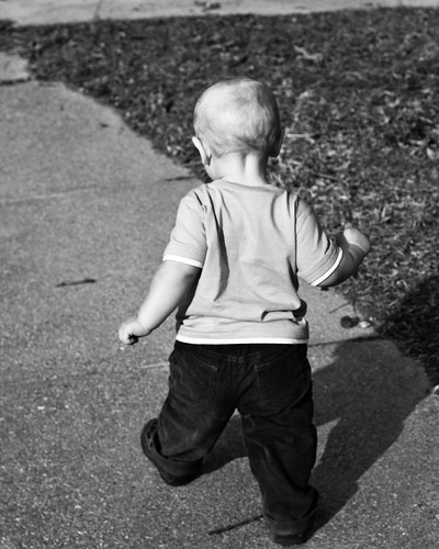
Bring back some of the old darkroom magic with local adjustments in Lightroom. Dodging and Burning are time honored techniques in the darkroom and are easily simulated in Lightroom. Say the image is too dark in parts leading to loss of focus on the subject. This was the case in the photo at the top of the post. My son's shadow merged with his pants after I applied my Neopan Acros preset. So I simply clicked on the adjustment brush, selected the shadow and increased its exposure, lightening the shadow to differentiate it from his pants.
You can bright and darken by this method. You can locally adjust contrast and brightness. Most importantly to me you can locally adjust clarity. Most of my film presets crank up clarity to get the sharp look of film, however this may not be desirable in photos of people. If this is the case, locally select the face and drag the clarity down. This will reduce the detail level in the face, allowing you to soften their look to make it more appealing. You can even bring clarity down into the negative range to create a soft focus effect, blurring out fine detail whilst retaining normal detail. In other words, fade away wrinkles, freckles and so forth...plus negative clarity makes skin glow, and you can make it look almost surreal.
Local adjustments with the adjustment brush allow you to really fine tune your monochrome image, but do not forget to use graduated filters when you need them. Drop a grad filter across a bright sky and bring the exposure down a bit to bring out detail and balance your image. Play around with you local tools, as they let you bring back the old darkroom techniques that were used to create prints. As any old school B&W photog will tell you, making the picture on film is only part of the process, putting it on paper is the rest. Dodging and burning to bring added depth to a print, sometime even from a flat negative.
4] Image Details (Sharpness, NR and Vignettes)
Don't forget about sharpening and noise reduction either. It is often easy to forget to do so when working in monochrome. Sharpen you image for you desired output, be it screen or print. Sharpening ca also be used to accentuate noise in the image, which is desirable if you are emulating a high-speed film such as Neopan 1600. Work the noise reduction sliders to either smooth out the image or allow more grain to shine through. These tools allow you to give your image that classic film look about as good as you can in Lightroom. Hopefully one day they add a grain control also.
Although I am not big into vignettes, the look great in monochrome. Play around with getting those corners darker, sometimes it unlocks a feeling in an image that you do not get otherwise.
5] Toning
Finally if you want to tone your monochrome image, play with split toning. You can choose either the highlight or shadow split tone and give it an orangish-red to create a sepia image. You can even set the highlight and shadow to different hues and saturation levels and adjust the balance slider to get a nicely balance duo-tone image. Play around, try sepia, blue and green tints. Toning is another way to really kick up an image.
Obviously these are just a few of the tools at you disposal to create beautiful monochrome images, however these are the area I work the most with and I figure I would share it with everyone. Sorry there were no screen shots, but this is a fairly long post and I wanted to get it up before I went to sleep. If you are familiar with Lightroom you get what I was saying. In the same right these tools are also in Adobe Camera Raw, so those of you with just Photoshop are not left out either.
These steps work if you are making a monochrome from scratch or utilizing my presets or those of others. Just take some time and explore each of these areas in Lightroom deeper and you will be making great black and white images in no time.
Oh, a new preset up tomorrow!
Until then,
Michael


1 comment:
Good stuff Michael. Your presets help take care of the heavy lifting on much of this but going in and making tweaks such as dodging and burning areas specific to my images has been important to get what I want. Thanks for the details.
Post a Comment